Visuals are powerful. It takes just .33 seconds to create an assumption based on trustworthiness or status.
That’s a third of a second for your your ideal customer to make up their mind about your brand.
… And according to Stanford University, 46% of people say that a website’s design is the #1 criteria in discerning the credibility of a company.
You need visuals that are not only beautiful but aligned to your brand.
Joana Galvao calls this The Sweet Spot.
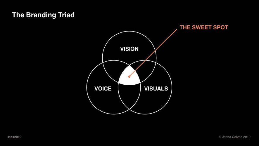
The Sweet Spot is when your brand voice, vision, and visuals are all in sync. Let’s break down what that means.
The Vision
Action that your brand takes, or the brand strategy.
The Voice
Your copy, messaging, or anything your brand says.
The Visuals
What your brand looks like, the design of your brand collaterals.
Most people think if the visuals look alright, they’ve done enough to represent their brand. But when you stop there, you’re missing out on the true power of design. Great design should:
- Create emotion
- Influence behavior, and
- Convert
Follow this recipe to find the sweet spot of perfect alignment.
Step 1: Your Strategy
Let’s get clear on the foundation of your business. Neither design nor copy can happen without crystal clear strategy. You should know your target audience, positioning, and brand mission.
Step 2: Your Brand Identity
There are 5 elements that capture the essence of your brand — so your audience knows you before they ever read a single line of copy.
- Color scheme
- Fonts
- Look and feel
- Design elements
- Logo
Your logo should be the last thing you determine when defining your brand identity.
Why? Because most brand impressions are made without the help of a logo.
Let’s try a little experiment.
1. Which shampoo looks more expensive?
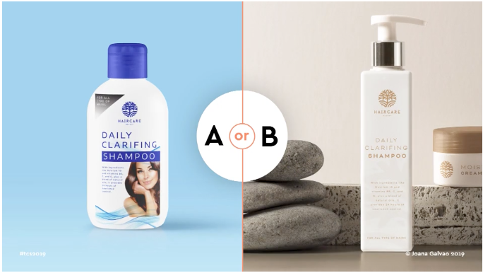
B! Its neutral colors, soft font, and imagery of stones evoke the feeling of an upscale spa experience.
Why not A?
Check out the imagery associated with old-school, drugstore brands:
- A glamorous model with shiny clean hair
- Easy-to-read font and color choices
- Stock graphics designed to make you think of cleanliness and a no-fuss experience
2. Which coffee looks like it has more caffeine?
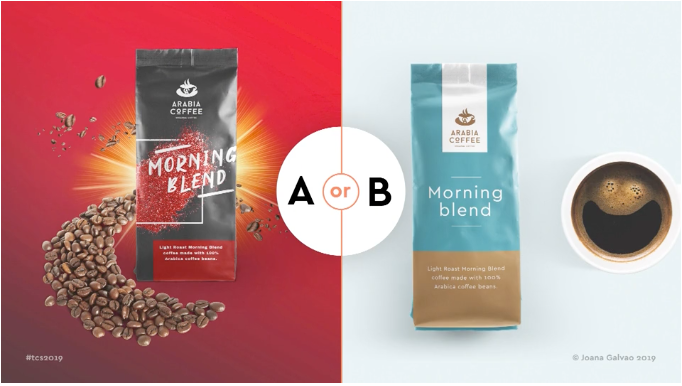
A.
The bright red color, the product bursting from the page, and the all-caps permanent marker font screams a loud and punchy start to your day!
Why not B?
A soothing blue color, uncapitalized letters, and a smile floating in the coffee cup creates a feeling of calm contentment — definitely not a ton of caffeine.
3. Which cookies look like they have more natural ingredients?
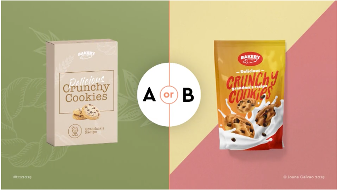
A.
The green background, soft translucent images of grain, and farmhouse style font choices make this brand feel natural and homemade.
Why not B?
A couple things make this ad look like it’s targeted for children, who don’t usually care about ingredients. Pink, red, and yellow evoke the image of candy. Cookies surfing on milk is a common cereal box trope.
Conclusion…
In a split second, your brain assesses visual cues and instantly forms an impression about the brand image you see. You didn’t even have to think about it. You immediately understood the brand you were seeing.
What about the logo? You probably didn’t notice it with all the other elements going on.
In fact, the logo and product name were identical for each example. Same logo. Same copy.
Let’s dig into the other elements of brand identity.
COLOR
Color plays a huge role in your brand identity. It’s the secret to your secret sauce.
Back in the 50s, Proctor & Gamble decided to test a few different varieties of washing powder with a group of housewives.
Thinking color might have an impact on sales, they ran an experiment with yellow, red, and blue.
The yellow powder group said, “Meh. Didn’t really wash well. Wouldn’t really recommend it.”
Red had the opposite reaction. The housewives said that red was SO effective, it would ruin their clothes over time!
Blue, on the other hand, was the unanimous favorite. Blue cleaned the best but was gentle enough to protect their clothes. It even smelt the best, so fresh and so clean.
Color totally alters perception, meaning it can influence how we interpret other senses like smell, feel, and taste. We’re primarily visual creatures, with
- 70% of our sensory receptors in our eyes
- 50% of our brain involved in visual processing
- Visual information being 90% of the what’s transmitted to our brain at any given time
It’s no wonder that seeing something can trick you into thinking that you’re really feeling it or smelling it.
Step 3: Your User Experience
Imagine you’re in Steve Harvey’s shoes. You’re about to announce the winner for Miss Universe 2015. You’re live in front of thousands of people being broadcasted all over the world. Lights are focused on you. Suspense music crescendos. You glance down and see:
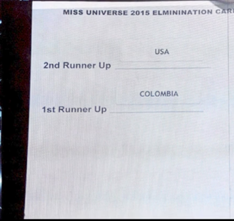
#2 — USA
#1 — Columbia
You announce, “Miss Columbia!” The crowd erupts in applause, fireworks go off, and Miss Columbia receives the crown as she stands raising her flag, soaking up all her glory. You look back down at the card and see the other half:
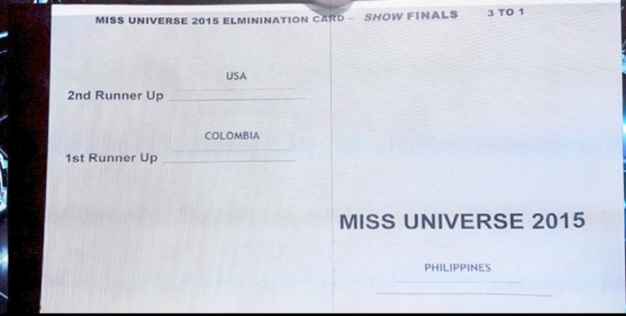
Miss Universe 2015… Philippines.
How did this happen?
The visual cue of “1st” is so powerful that it automatically overrides all other processing. 1st communicates the best, the top, or the beginning. It’s perfectly understandable that you would miss the words “Runner Up” when under extreme pressure.
Talk about a poor user experience!
What do you think the outcome would be if the card looked like this?
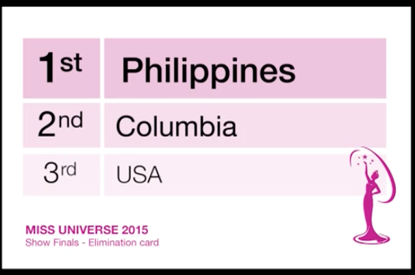
It’s hard to imagine misinterpreting the symbols here.
Your content should be:
- Quick to understand
- Easy to navigate
- Delightful to experience
Imagine you’re on stage at the Oscars and it’s time to present the award for Best Picture, the most coveted and anticipated film award of the year.
Here’s your card:
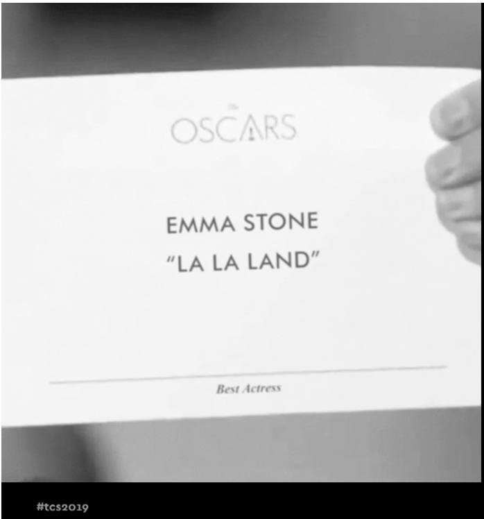
What do you see first?
The Oscars logo. As Joana said, “My guess is that if you have this card in your hand, you don’t need to be reminded that you’re at the Oscars.” This time, the logo is a distraction. It only complicates visual processing for you.
Next? ALL-CAPS. Our brain identifies shapes, and all-caps font looks like a pile of rectangles, making it much harder to read.
What about font size? ‘Emma Stone’ and “La La Land” are equally large — indicating equal importance. Which line really counts? One could argue that the first line is automatically more important, but our brains tend to scan for information that is relevant in the context of the situation. In this case: the name of the film nominated for Best Picture.
Let’s put this design to the test. Which category does this card belong to? Look at the bottom. Under a section break, in teeny tiny italicized letters, Best Actress.
You see the problem? These serious design flaws cause you to see “La La Land” and not much else.
Even worse: it’s very difficult to determine the critical error of the night: you have the wrong card.
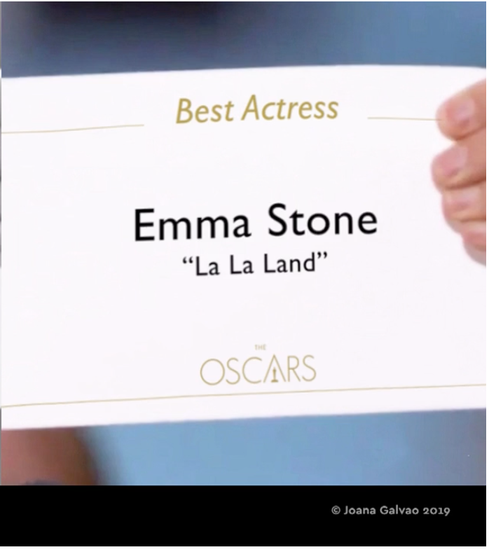
In this version of the card, the category is immediately clear and affirmed in two places. “Best Actress” is large and clearly visible at the top of the card, and “Emma Stone” is denoted as much larger and easier to read than the name of the film. At the bottom of the page, the logo is the rightfully shown as least important piece of information.
Which card does your website look like? Your website should eliminate unnecessary visual processing and decision-making.
Bad user experience increases bounce rates, which of course hurts your conversions.
Increased bounce rates in turn affects your SEO!
Which means that bad web design can actually hurt your traffic AND your conversions.
Establish a Great User Experience BEFORE you design your site
List everything your customer needs to know before they decide you’re the one. Interview your returning customers or sales team to get ideas.
Rank them in order of importance.
Sketch a wire frame that provides the most important piece of information first. Plan for a lot of white space which helps drive the reader throughout your site.
Get to work
Before you go to your designer, use these principals to develop a comprehensive brand identity and specific user experience. Only then can you deliver a design brief that is truly aligned with your brand — bringing you one step closer to the sweet spot of the branding triad.
And if you’re ready for more…
Traffic & Conversion Summit 2020 is happening December 15 – 17 in San Diego. In 3 content-packed days, you’re not only going to get expert sessions from Ryan Deiss but also marketing legends like Marcus Lemonis, Roland Frasier, Billy Gene Shaw, Ezra Firestone, Mari Smith, Rachel Bell, Kevin Harrington, Kristen Bryant, Richard Lindner, Goldie Chan, Chalene Johnson and many more. Find out more here >>